CLIENT
Officina Local
WHAT I DID
Brand Identity
Product Packaging
Art Direction
Collateral
TEAM
Lucas Malta and Maria Fontenelle
Infusing modern flair into every slice of tradition
At the heart of this project lies a logo adorned with impactful, handcrafted typography. Picture this – an artful detail: openings in the 'O' and 'A,' subtly paying homage to the warmth of a wood-fired oven. This distinctive touch extends beyond the logo, becoming a motif across brand elements.
Expanding our palette, we crafted signatures, merging secondary typography with a playful semicircle and the clever 'O' outline. The result? A visual language seamlessly adapting to any canvas, physical or digital.
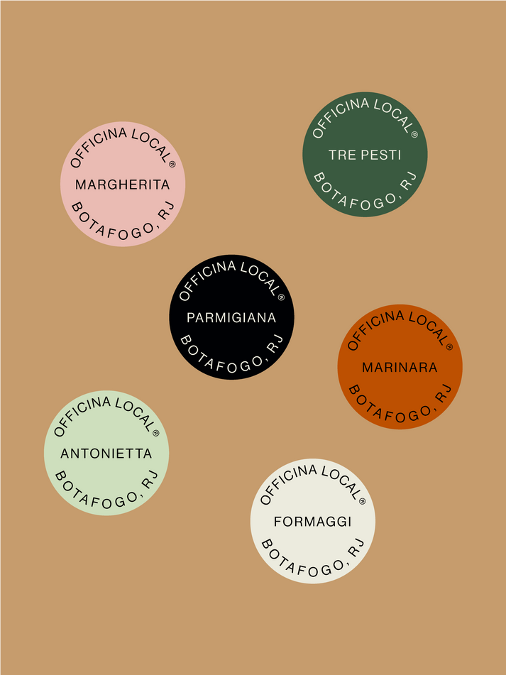
Inspired by vintage auto workshops, we evolved into a refined brand, where nods to the past gracefully reside in classic colors. A modern, urban identity exuding familiarity, approachability, and casual charm.
Captivating, resonant, and seamlessly fitting into diverse environments.


